UPC Case Study From Click to Purchase: Designing a Frictionless User Experience


Who is UPC?
The UPC brand needs no introduction. One of the biggest players in the field of Internet and TV operators approached us with a project in which they were preparing changes in their ordering system both in the background and on the front-end. As the trend of customers moving online is getting stronger (and will only grow in the future), UPC needed to provide its potential clients with a user-friendly and easy-to-understand environment for ordering services.
From the nature of the services that UPC provides we have encountered several challenges:
- Verification of availability ?
- Combining services ?
- Multiple services for digital TV ?
- Choice of commitment period ?
- Communication of TV stations in packages ?
- Possibility to purchase additional equipment ?
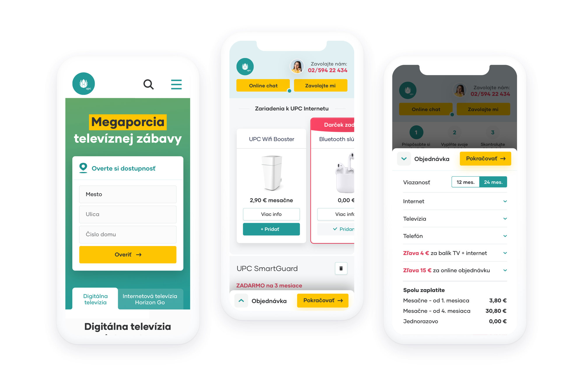
- Naturally also on mobile ?


Solutions and strategies
Despite the fact these two online shops represent two respective companies with independent accounting systems, thanks to the flexibility of our CMS BUXUS, we managed to unite them under the same administration.
Our cooperation started when we decided to work together on the classic online shop for the end user - B2C solution. After the Slovak version was successfully launched, we designed another B2C solution, this time for the Czech market.
Enthusiasm for growth was truly stimulating and we launched the first B2B portal for our wholesale partners (e.g. book shops) in 2015 and B2B portal in the Czech market in 2018. Nowadays, these two websites coexist as two B2c and B2B online shops in two countries as independent entities. Everything is run by CMS BUXUS.
We have gone through the proposed basic solutions with the client again and collected feedback - what can and cannot be done, where the limitations are, and what we can improve. Overall, we iterated on the design and features with the client in three workshops to ensure absolute certainty that the final product will meet the client's expectations and contribute to a positive user experience.
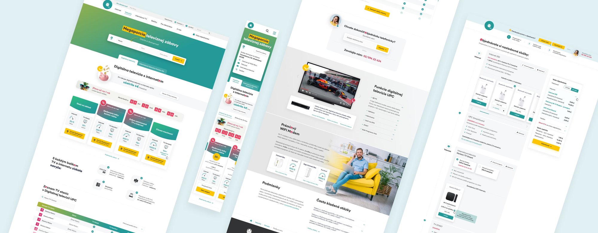
Great news for our designer was that we were able to approach a complete "facelift" of the website during the graphics creation, by introducing new UI elements, slightly adjusting the color palette, and even choosing a new font that is more readable and visually appealing. Not every client is willing to undergo such changes, which is why we highly appreciate the trust UPC has shown us by agreeing to these modifications.
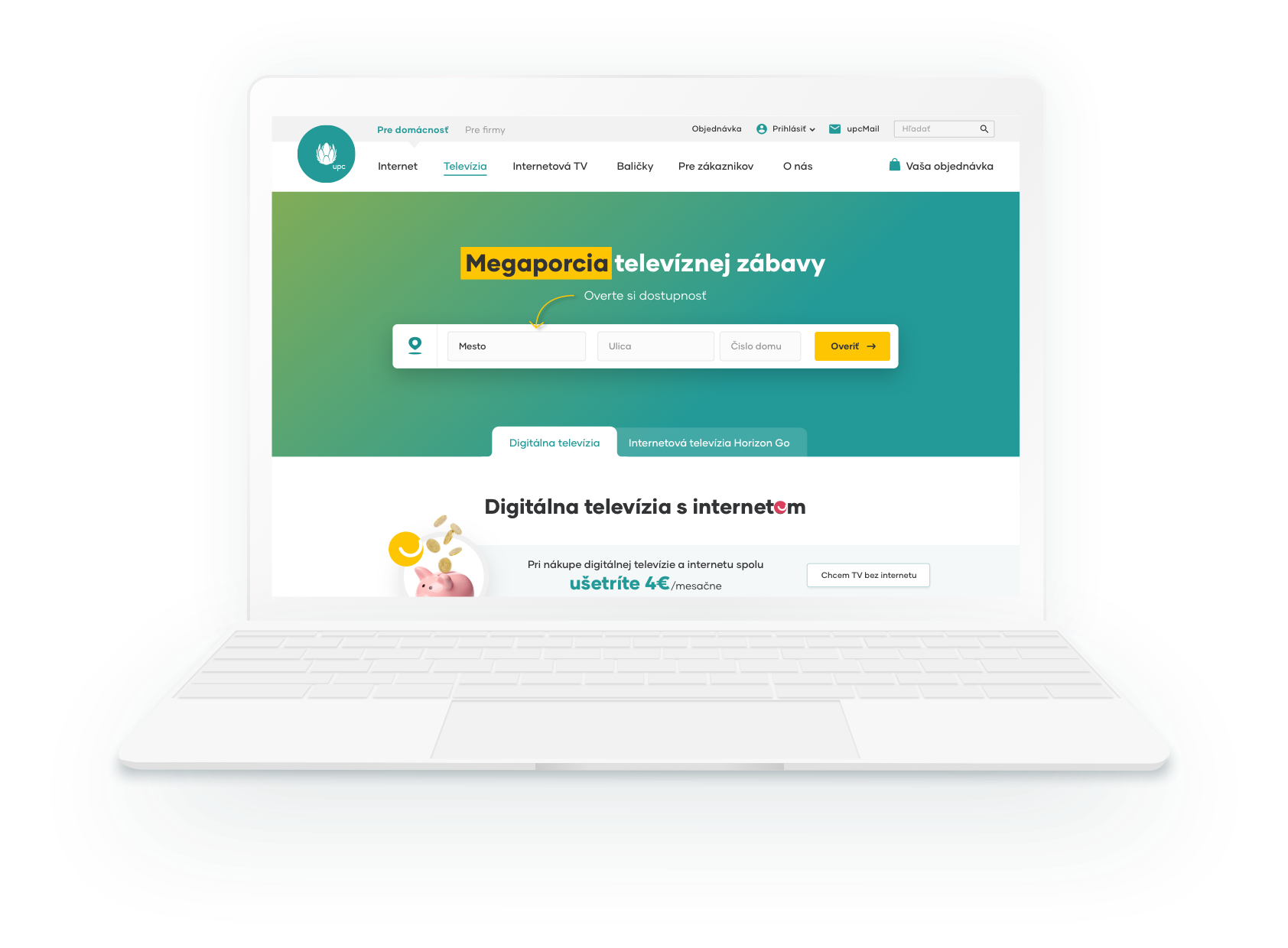
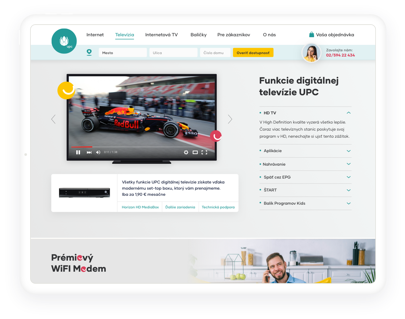
The result of the collaboration between UPC and ui42 is a user interface design for the landing page and checkout process in a clear and visually appealing format (see screenshots in this case study), with a focus on customer understanding.


How did you like the collaboration?
We conducted a selection procedure when choosing a provider of UX/UI services. Among several companies, we selected ui42 for their comprehensive range of offerings, additional service options, and high-quality references from their extensive professional experience in the field. Throughout my more than 20 years of work in the online business industry, I can confidently say that the services provided by ui42 and its employees are of a very high professional standard, even on a global scale.
Contact us
Do you need user friendly web?
-

Michaela Recht
Sales Executive
I specialize in:
- UX/CX
- Marketing
-

Samuel Štassel
Sales Executive
I specialize in:
- Development
- AI


