StartLab Case Study Empowering dreams, igniting success in StartLab.
Results in numbers
+ 51 %
Year-over-year growth of campaigns
- 70 %
Decrease of support workload

What was the goal of the StartLab and ui42 cooperation?
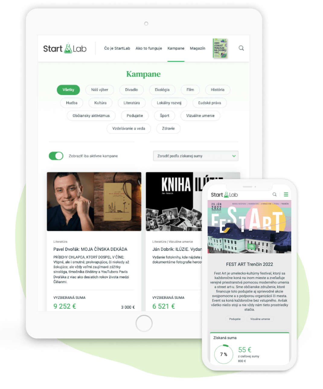
The main goal of the cooperation was the creation of a website which would be user-friendly for two groups of users–authors and campaign sponsors. The main observed metric was the conversion rate of supporters, which had been declining. Improving the platform efficiency and unburdening the support team were the main reasons why StartLab approached us.
The extent of the cooperation
- analysis of the default situation
- UX testing–interviews and testing with project authors and supporters; a survey of the project authors regarding their experience and satisfaction with the portal
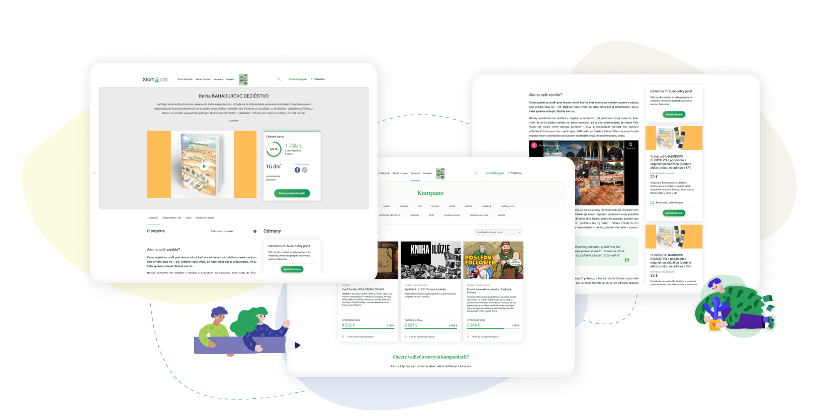
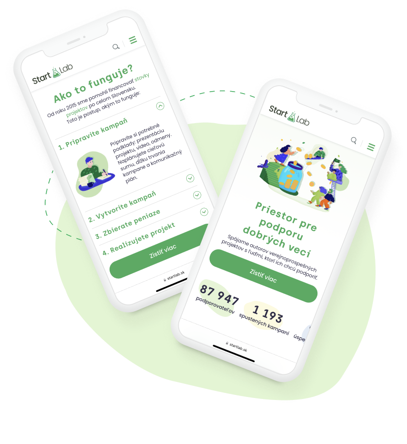
- design of new user interface–UI
- UX testing of the new design

The course of the project step-by-step
Step 1. Kickoff meeting
During the introductory meeting, we and the client defined goals which they wanted to achieve. Then we chose tools which were going to help them in the most efficient way, as well as the metrics which were to help us clearly find out whether we achieved the goal.
Step 2. Analysis of the default situation
Diligent analysis of the original design and functionality of the elements comprising the platform delineated where we stood, thanks to Google Analytics and Hotjar tools.
Step 3. UX testing and user research
Testing was executed with two user samples (campaign creators and supporters). After the preliminary preparation of the testing scenarios and detailed criteria definition for both groups, controlled usability testing followed. Apart from that, we conducted individual interviews with both portal user samples and a survey which mapped experiences and satisfaction of the campaign authors with the original portal version. A qualitative questionnaire was part of the final analysis and its interpretation. Those campaign authors, who did not finish the campaign making process, expressed their opinions there.
Step 4. Wireframes proposal and making of the final interface
Transactional non-aggregated data need to be sorted into datasets where they fall into categories by sessions, which consequently enter neural network.
Step 5. Final UX testing
After we made the final user interface, we conducted its further testing. The goal was to verify and validate its functionality and usability of the whole project, which reflected the findings from the first testing.

Cooperation results
Apart from the higher conversion rate represented by the increase of campaigns year-over-year by 51% and decrease of workload of support employees, significant progress was made with the satisfaction of campaign authors. On a scale of star ranking we achieved 93.4% satisfaction. On average, 4.67 out of five users are satisfied with the final new design of their campaigns.

How the client sees the cooperation with ui42?
We really appreciate the complexity of the cooperation. The proposals were not made "from the table", but on the basis of real data. They showed us the deviations between our assumptions and reality, helped determine priorities and, last but not least, minimize the risk of not meeting the project's goals. It was a pleasure to work with your team.
Contact us
Do you need to improve UX of your site?
-

Michaela Recht
Sales Executive
-

Boris Henezi
Sales Executive
-

Samuel Štassel
Sales Executive


