Prvá stavebná sporiteľňa | Case Study Enhancement of the product portfolio through UX testing

The main goal of the project was the design, creation, and implementation of a new website with a focus on a complete rebranding. We discussed the first phase of this project in a previous case study.
You can find information about the results of the subsequent research conducted on the redesigned website and the further development of the project in this case study.
The initial phase
In the initial phase of the project, the requirements for user testing of the redesigned website were already known. The goal of this step was to gather user feedback on the new visual design, but the main priority was to verify the usability of the website. We always recommend repeated usability testing, as we consider it essential for validating the proposed and implemented changes.
Key cooperation milestones

June 2022
Launch of the website after a complete redesign
August 2022
User testing of the redesigned website
November 2022
Design iterations, workshop with PSS, and presentation of proposed changes
Jan./Feb. 2023
Creating a clickable prototype based on workshop feedback
March 2023
User testing of the prototype
August 2023
Implementation of the tested solution
UX steps
1. Preparation of the 2nd Round of Research
After launching the website in June 2022, we began working on usability testing. The target user groups and testing scenarios remained almost identical to the first round of testing of the original website. The only change was a greater focus on usability and understanding of the MojaHYPOTÉKA products, which had been added to the product portfolio in the meantime, and MôjDOMOV, which is considered one of the company's flagship products.
2. Results of the Second Round of Research
The research results clearly indicated a high level of satisfaction among respondents with the new visual design. The website simultaneously identified minimal usability issues, with one exception, which was the landing page for the "MyHOME" product. Testing revealed significant shortcomings in product comprehensibility. 9 out of 10 tested respondents did not grasp the basic functioning and benefits of the product. From the beginning, we considered "MyHOME" as a comprehensive financial product, but specific targeted research revealed opportunities to present the product simply and understandably.
For example, here are some specific findings:
- Users do not understand that the product is a combination of savings and a home loan. Video is crucial for understanding the "MyHOME" product, and the current display method on the website is inadequate.
- The current calculator solution does not support product explanation and is too complicated.
- Video is crucial for understanding the "MyHOME" product, and the current display method on the website is inadequate.

3. Brainstorming -> Design -> Client Workshop -> Prototype
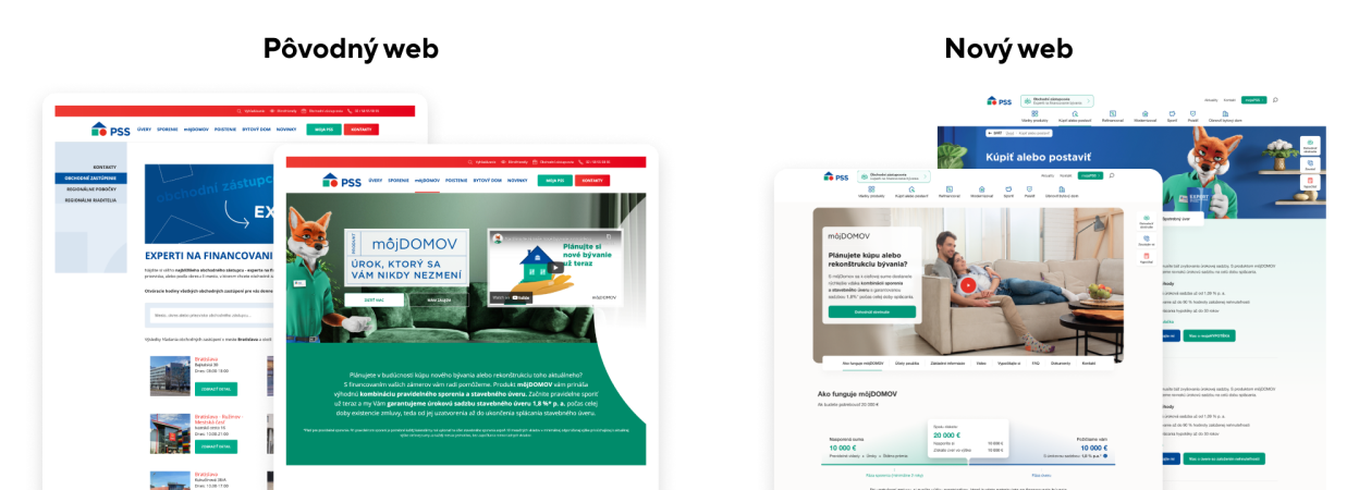
Based on the findings, specific improvement suggestions were formulated. Iterations of the original solution resulted in a refined concept for the product landing page. Subsequently, a workshop with the client was organized, attended by representatives from the product and marketing departments. The purpose of this meeting was to thoroughly fine-tune the entire page to ensure a user-friendly experience while meeting the needs of marketing, as well as the requirements of the product and legal departments. The result of this project phase was the creation of a clickable prototype, representing the visual and interactive form of the MyHOME product page.
For example, some of the proposed changes include:
- Creating an infographic that explains the main principle of the product, similar to the existing product video.
- Breaking down the calculator into multiple steps to mimic the product's functioning.
- Adding specific model life situations to explain who the product is suitable for and how it is used.
4. Research Round 3 - Prototype Testing
With the intention of validating the presented iterations and minimizing extra development costs, this time we tested the proposed clickable prototype with six respondents. The results of the testing clearly demonstrated that the presented prototype is a suitable solution, as it contains all the necessary information and fully meets user requirements. All six respondents displayed the ability to understand the product, evaluated the product positively, and found the page to be simple and written in clear and understandable language.

The solution
In the beginning of this project phase, there was a product page that did not take into account the specific requirements of such a complex product as "MyHOME." The page did not meet the basic user requirements, as confirmed by usability testing, in which only 10% of the tested respondents could understand the product. Gradual iterations, taking into account the findings from usability testing and close collaboration with the client, allowed us to create a product page that 100% of the tested respondents could comprehend. The proposed solution not only fulfills user needs but also effectively communicates the key benefits of the "MyHOME" product. This project is a direct proof of why it is important to test websites even after their redesign implementation and demonstrates how repeated testing ensures the achievement of optimal results.
Contact us
Do you need help with your web?
-

Michaela Recht
Sales Executive
I specialize in:
- UX/CX
- Marketing
-

Samuel Štassel
Sales Executive
I specialize in:
- Development
- AI


