Generali Case Study + 50% increase in the conversion rate
Who is Generali?
Generali counts among well established and strong players in the Slovak market. It offers quality products ranging from life and vehicle insurance to property, accidental injury and travel insurance. Generali is proud of their pro-client attitude and individual tailor-made solutions. Their efforts have been appreciated and translated into many awards that Generali have been gaining annually at prestigious competitions organised by insurance and financial institutions.


Cooperation of Generali and ui42
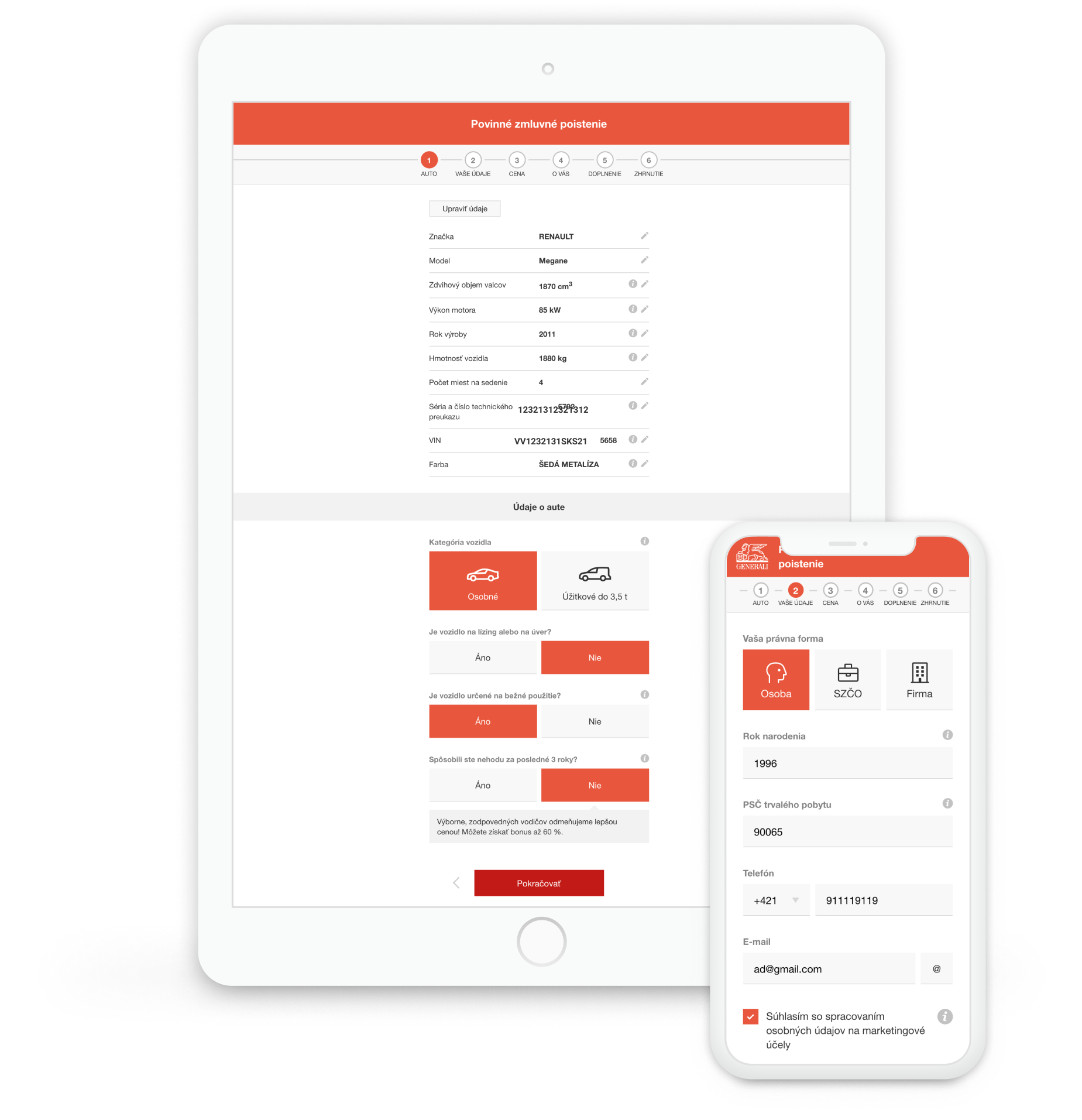
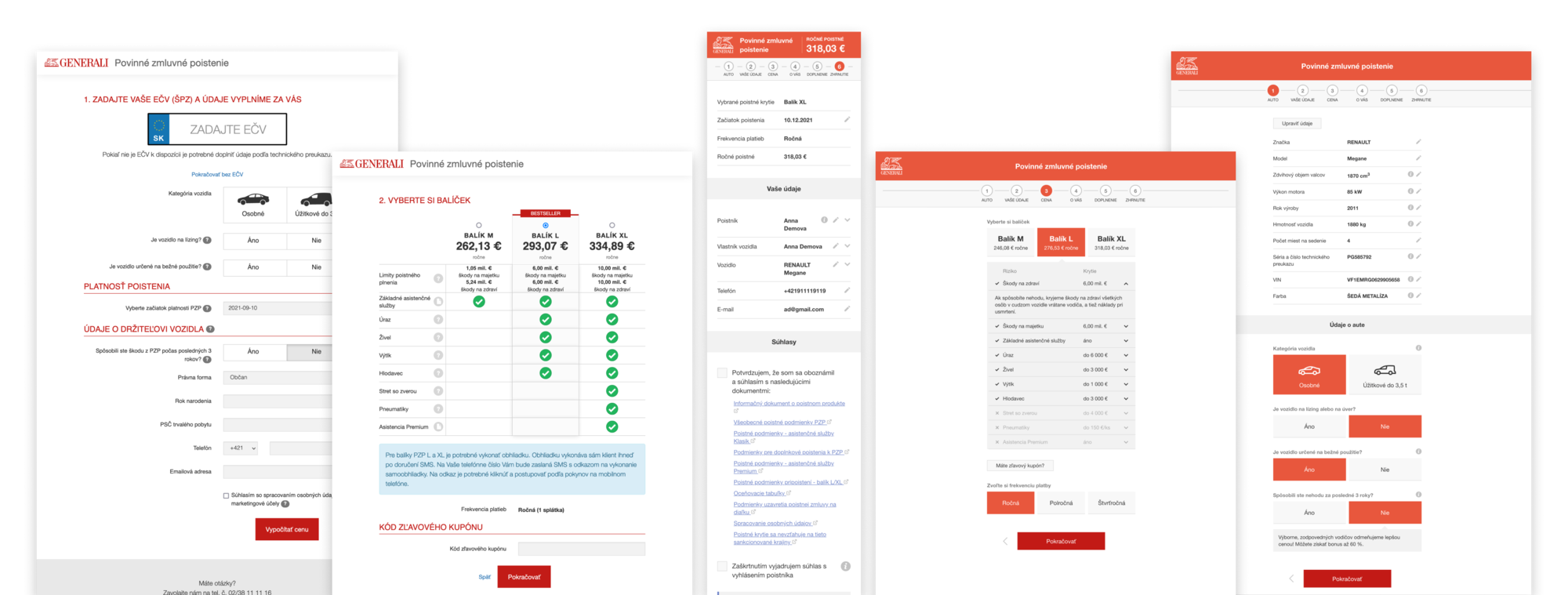
The foundation stone of our cooperation was an online tool - a collision and liability car insurance calculator which can be found on Generali’s website. It helps clients not only calculate their insurance price according to the selected parameters but also purchase it online. Before Generali published the new redesigned version on their website, it decided to put both versions (old and new version of the calculator) to a test in our UX lab.
Cooperation Goals
- compare UX for new and old calculator
- discover new calculator’s areas for improvement
- design solutions for ideal user experience
- decrease pressure on customer support when purchasing collision or liability insurance
- increase the conversion rate
Step by Step Overview
Step 1 – Kick off meeting
During the kick off meeting, we defined the goals the client would like to achieve. In addition to these, we agreed on basic steps necessary for achieving the goal successfully.
Step 2 – current state analysis
To understand our initial position, it was necessary to analyse the condition the product - a collision and liability car insurance calculator - was in. Our teams conducted a thorough audit which provided us with clear answers.
Step 3 – UX testing
Both versions of the calculator (old and redesigned) were put to UX testing both in mobile and desktop versions. We prepared testing scenarios, defined target group criteria, launched modern UX testing and finally analysed our findings, which we then interpreted for the client.
New calculator rewarded us with a 50% increase in the conversion rate
Thanks to testing and integrating recommendations, we created a new collision and liability insurance calculator, which does its job with an obviously positive impact after we eliminated all the previous minor imperfections. If we compare it to the old calculator, we can see a 50% increase in the conversion rate and also completing another one of our goals - increase in lead generation by a whole third!
+ 32 %
Generating lead rate
+ 56 %
Conversion Rate

Key findings for redesign of the new Generali calculator
Simple text and formulation
Thanks to usability testing tools, we could tell that it is the insurance jargon and terminology used in this industry that are difficult to understand for the end user. One of the key changes would then be to choose simple and comprehensible words which can be easily understood by the potential client using the calculator, so they know what words to use in respective fields.
Transparency and clarity
Small script in difficult-to-find parts and lots of allusions to incomprehensible notes attempting to explain insurance terminology can get website users confused and their perceiving of the offer as unclear. This can lead to loss of comfort and the feeling of security when purchasing the insurance and can cause cracks in trust in the given product.
Tone of voice without confusing terminology
Purchasing insurance is not an everyday task, we need to anticipate that the user will not be able to master the terminology immediately. We need to place focus on comprehensible words and also detailed explanations to make sure everybody understands every new word or knows where to find their meaning.

What Generali said about our cooperation.
We were troubled with the low conversion rate of our old collision and liability insurance calculator. Together with ui42, we dived into usability testing and managed to eliminate lots of UX imperfections which were interfering with our user's positive experience but which we had not been able to identify. At the same time, we were provided with detailed suggestions for adjustments and improvements which significantly helped increase our calculator’s conversation rate and move it to a brand new quality level.
Contact us
Do you need to improve your online product?
-

Michaela Recht
Sales Executive
-

Samuel Štassel
Sales Executive


