Generali La Vita Journey mapping and UX testing
Cooperation between Generali and ui42
In 2021, we collaborated with Generali on a calculator for calculating mandatory contractual insurance. We have already written a case study about how we managed to optimize usability and achieve a 56% increase in conversion rate.
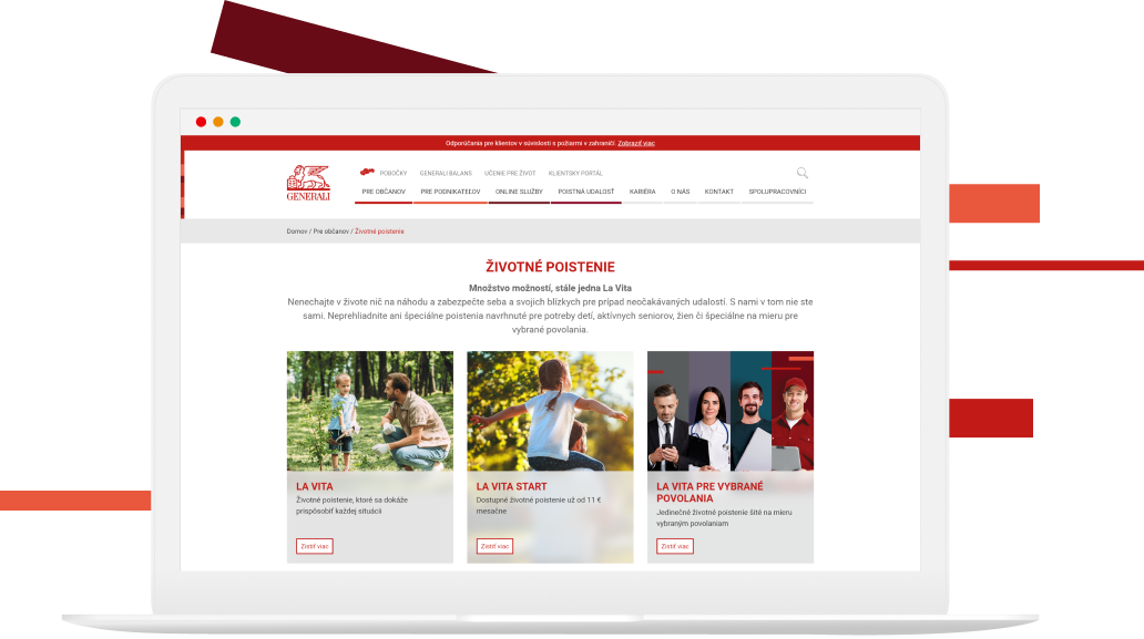
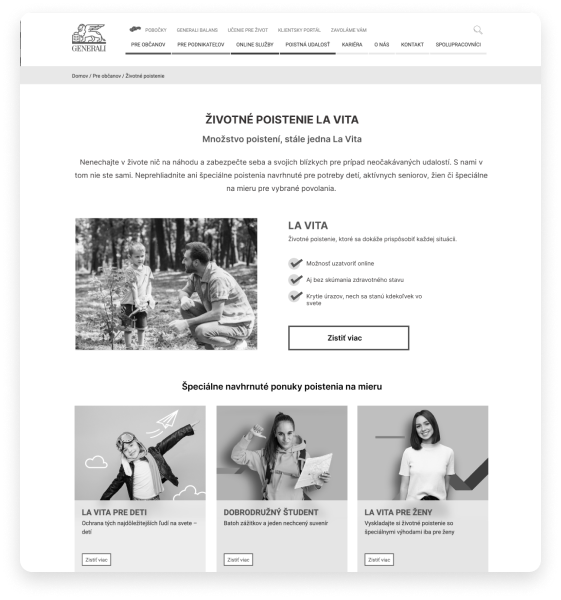
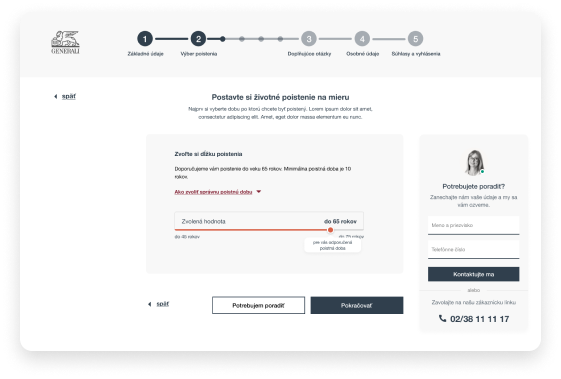
This time, Generali insurance approached us with a new challenge - to create an online life insurance calculator with the option to purchase insurance online. Life insurance is a highly complex product, both from the perspective of the insurance company and the user. The result of our collaboration was a prototype that defined the calculator's content, the placement of individual elements, and the entire customer journey. We also focused on the product landing page.
Goals of Cooperation
- Define the customer journey for closing life insurance online
- Create a prototype of an online calculator that meets the insurance company's requirements and is also user-friendly
- Set the rules for text communication of the calculator
- Test the solution with real users

The course of the project
1. Kick-off meeting
Initial meeting with the client. Defining project goals and requirements. It also included detailed training on life insurance matters.
2. Defining the Customer Journey
To understand customer behavior, we analyzed the entire customer journey from the initial product contact to the completion of insurance, whether online or at one of our branches. We identified potential barriers that users may encounter and that could diminish the quality of the customer experience.
3. Preparation of the wireframe for an online calculator
A prototype was created for the purpose of testing the calculator, built based on the defined customer journey. The prototype specified the detailed content of each step of the calculator, as well as the specific placement of elements and the precise text on each screen. Based on this prototype, the client developed the final visual appearance of the calculator.
4. User Testing of the Calculator
Testing of the client-supplied clickable prototype was conducted with 14 respondents. Both the mobile and desktop interfaces of the calculator were tested. The testing scenario included traversing the entire defined customer journey. The testing revealed minor usability issues and significant deficiencies in the product page. It did not include all the information users needed before entering the actual calculator, which could not only jeopardize the calculator's clarity but also decrease overall interest in purchasing insurance online.
5. Modifications and Optimization
In this step, solutions were proposed to address the deficiencies in the calculator that were identified through user testing.
6. Workshop with the Client - Product Page Content Proposal
The aim of the workshop with the client was to design a product page that meets all the client's requirements across departments (marketing, legal, product) while also containing all the information necessary for users to understand the complex subject of insurance.
Key findings
A good product page is as important as a good calculator.
A product page that sufficiently informs or even educates the user, especially in complex matters like insurance, is incredibly important. The lack of information that a user seeks on the product page can lead to issues with configuring insurance in the calculator or the possibility of abandoning the page without attempting to use the online calculator. A good product page should serve as a support for the online calculator and should prepare the user before deciding to purchase insurance online.
The number of steps should not be minimized at all costs.
A universal rule is that overly long forms remain abandoned and incomplete. However, short but chaotic forms can have the same effect on the user. For more complex products that most users only encounter occasionally, they realize that interacting with the form takes longer than a few seconds. Therefore, it is more optimal to structure information to be understandable, even with a larger final number of calculator steps.


How do you evaluate our cooperation with Generali La Vita?
We have successfully collaborated with ui42 in the past on the creation of a calculator for mandatory contractual insurance. Based on this, we have initiated a new partnership with a new request - to add the option to create an online life insurance calculator. ui42's professionalism in the field of CX/UX has once again been confirmed - they helped us create a unique online life insurance calculator tailored to customer needs. The entire project, from testing, adjustments, and optimizations to the final workshop, delivered a very high-quality result.
Contact us
Do you also want to test your web?
-

Michaela Recht
Sales Executive
-

Boris Henezi
Sales Executive
-

Samuel Štassel
Sales Executive


